MPG
ReturnMy NCEA Year 12 Design project was creating a Multiplayer Party Game called MPG.
I really enjoyed making MPG, and it was great to be able to actually commit to a big project all the way through and not just do small tests or studies that don't really give anything to show for.
Project Created: Jan-Nov 2025
Page Written: 21/02/2026
This page is not in chronological order.
Game Lobby
I did some environment concept paintings for the game lobby, where players would select what minigames to go into via the arcade machines.
I really like the vibrancy and contrast I was able to get in the image. having lots of small lamps light the room instead of a few big lights meant that the falloff of the lights could be very pronounced, and there could be areas at full brightness and then back to complete darkness in a very close proximity, which is very visually pleasing. I was also very deliberate about the light placement to create counterchange and edge variation.
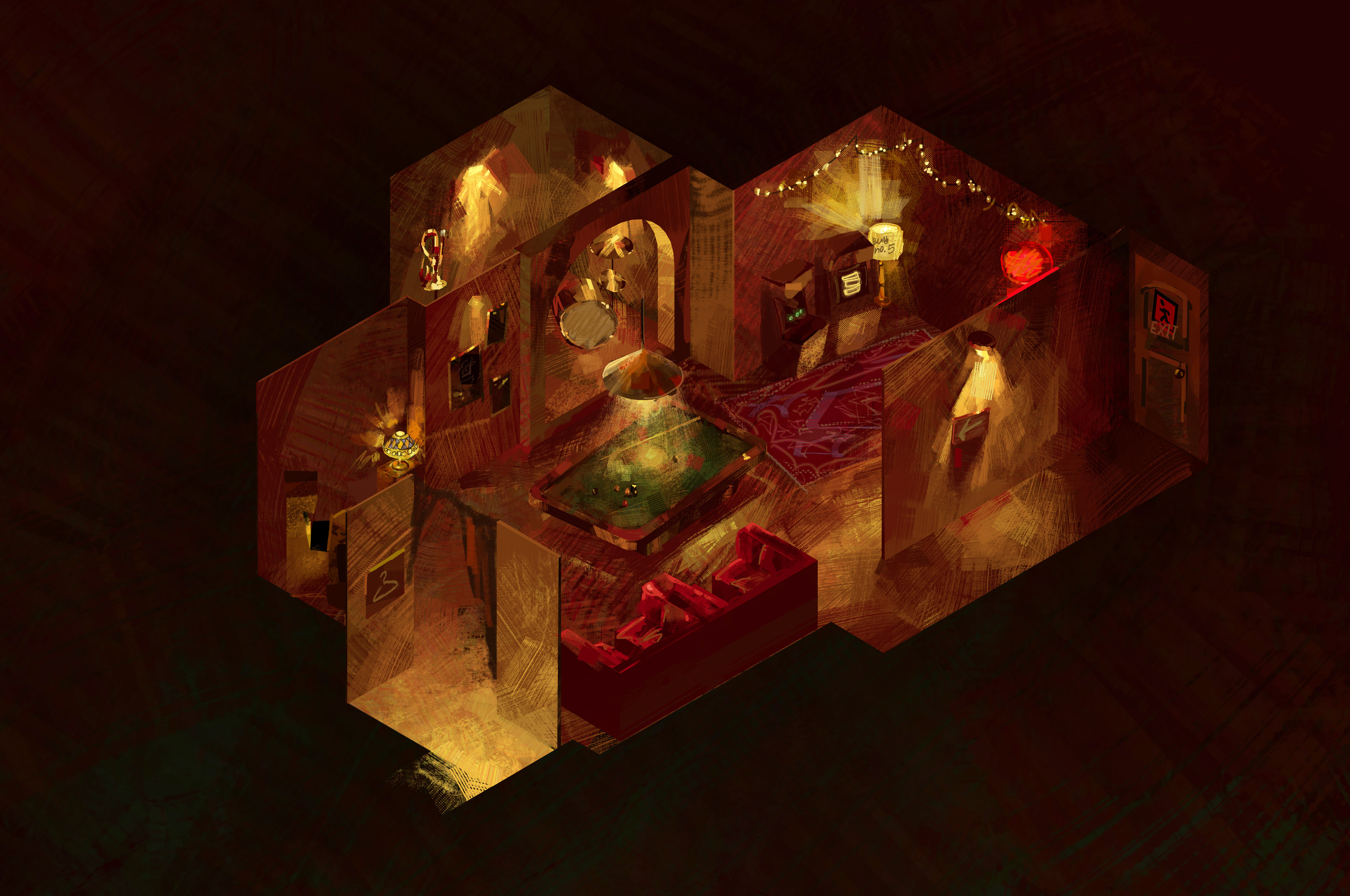
I think this is my favourite thing from the project.
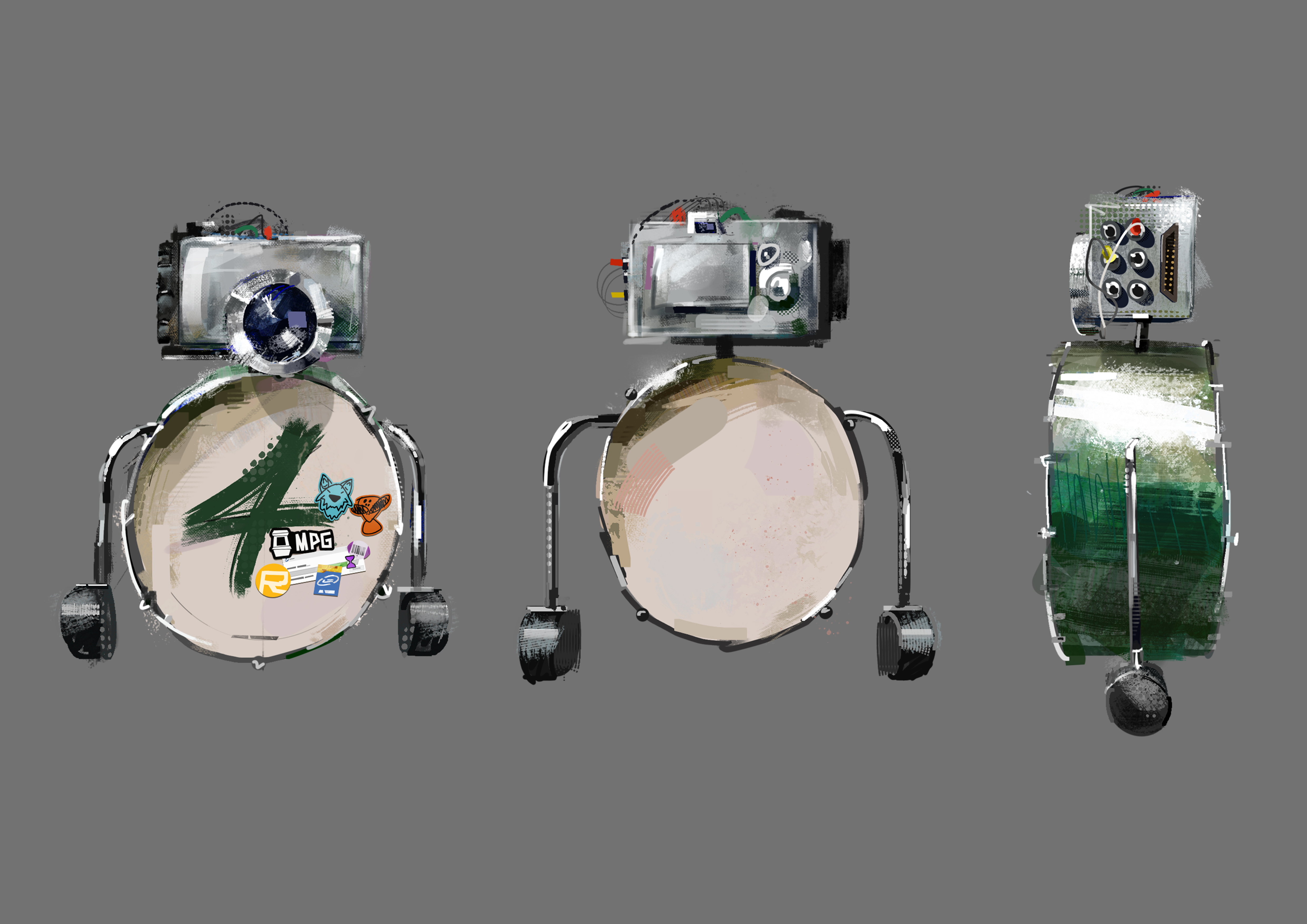
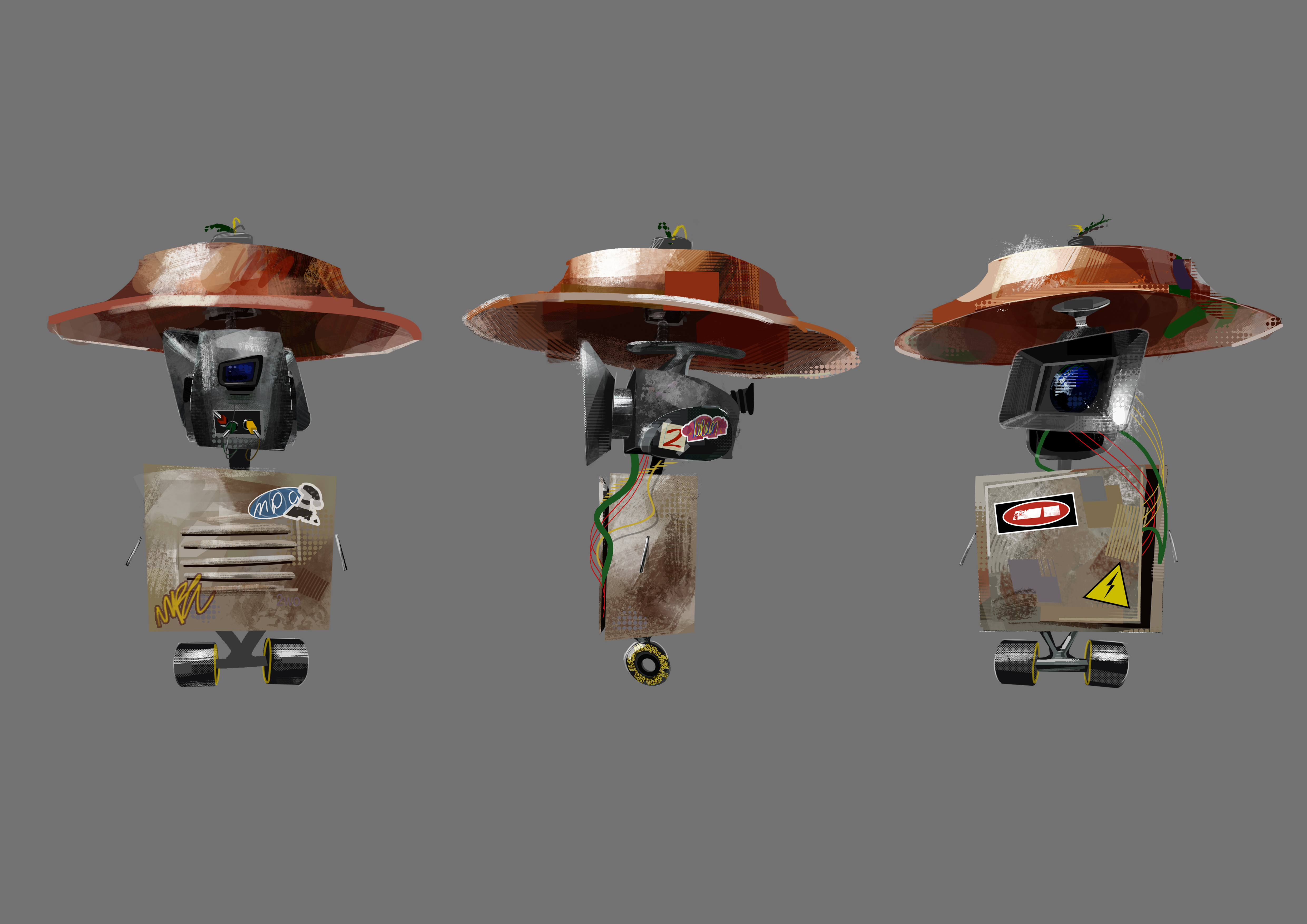
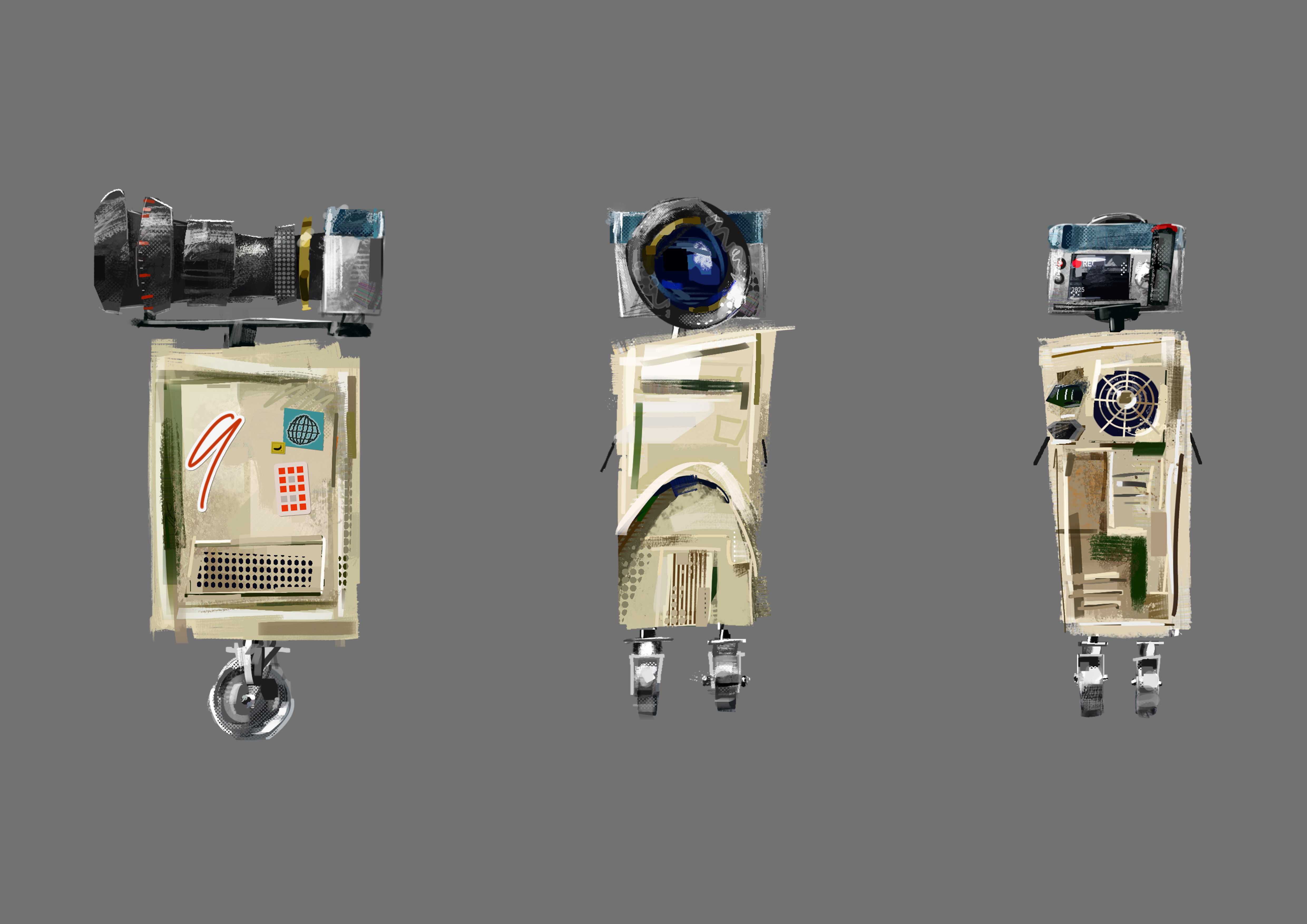
Character Design
I created designs for the characters that players would be playing as in the game. The idea was to make it look like the robots were build from scrap parts lying around the MPG lobby, and were assembled by players to give a more personal and emotional feel to the game.
To build on this idea, I added stickers referencing the project. Most notably, a reference to the spiderverse films as it was a big inspiration for the rendering style, as you can probably see. There are also cameos from my friends design projects who are in the same class. I thought that it would be a fun easter egg for people to catch when the boards were displayed together at the end of the year.
3D Characters
I made 3D versions of the three characters in Blender to use later in the gameplay images. Creating all the stylised shaders was super fun, and it was my first time doing non-photorealistic rendering in Blender.
Unfortunately, I was rushed for time and couldn't get the shaders to be able to react to the CG lights in the scene, so all the colours were hardset; effectively making them pretty much useless unless the characters are in a bright studio environment, like how they are presented above. The final result looks kinda bad and really I would have liked to have made them better, but it was still a lot of fun to do.
Gameplay Images
I made concept 'screenshots' to illustrate what the gameplay could look like. I wanted to make them look as close to reality as possible, so I treated the process as if I were making a real video game.
All the static elements, such as backgrounds were hand-painted. Anything that would move in perspective such as characters and props were created in 3D, and composited over the 2D elements.
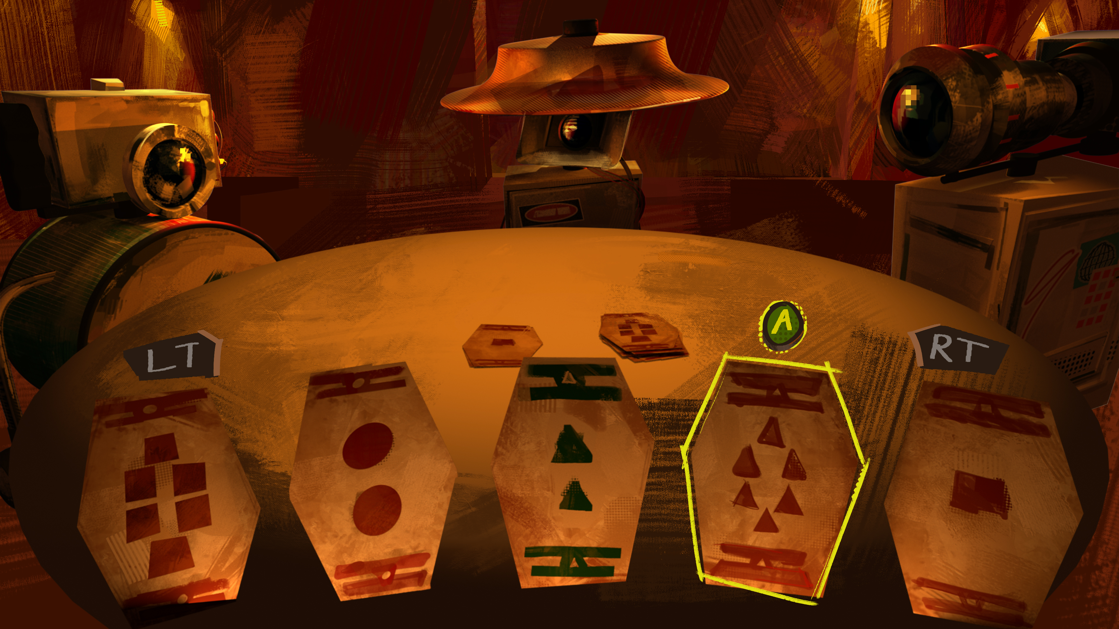
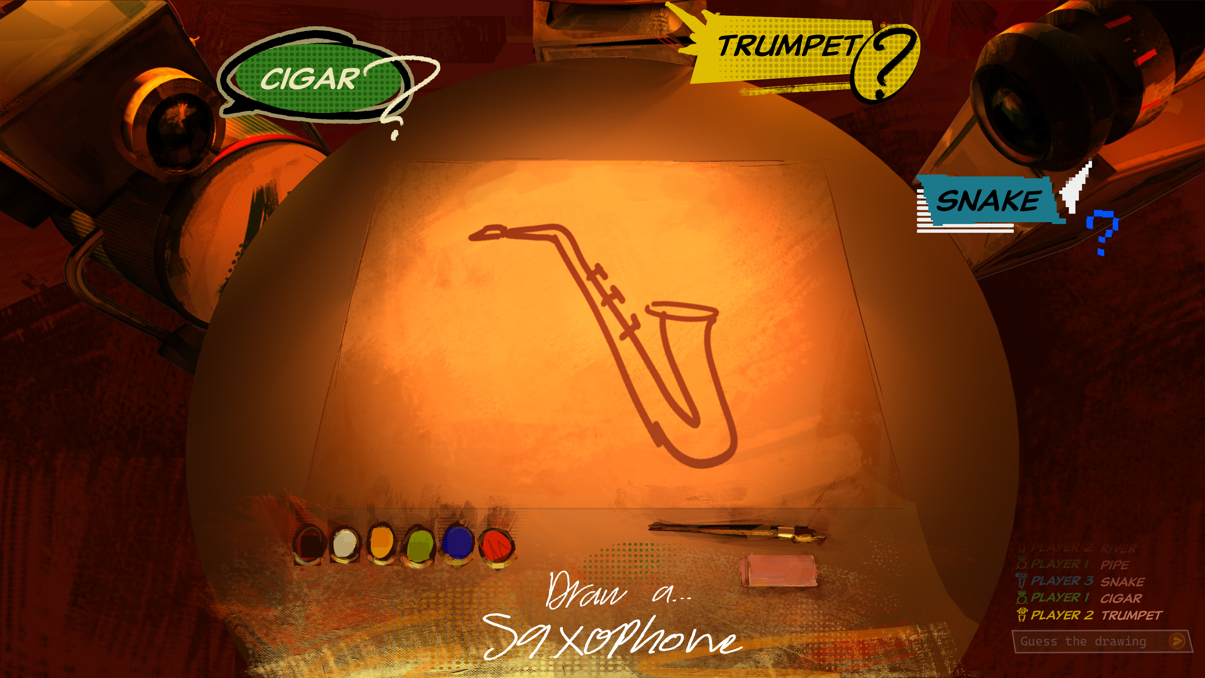
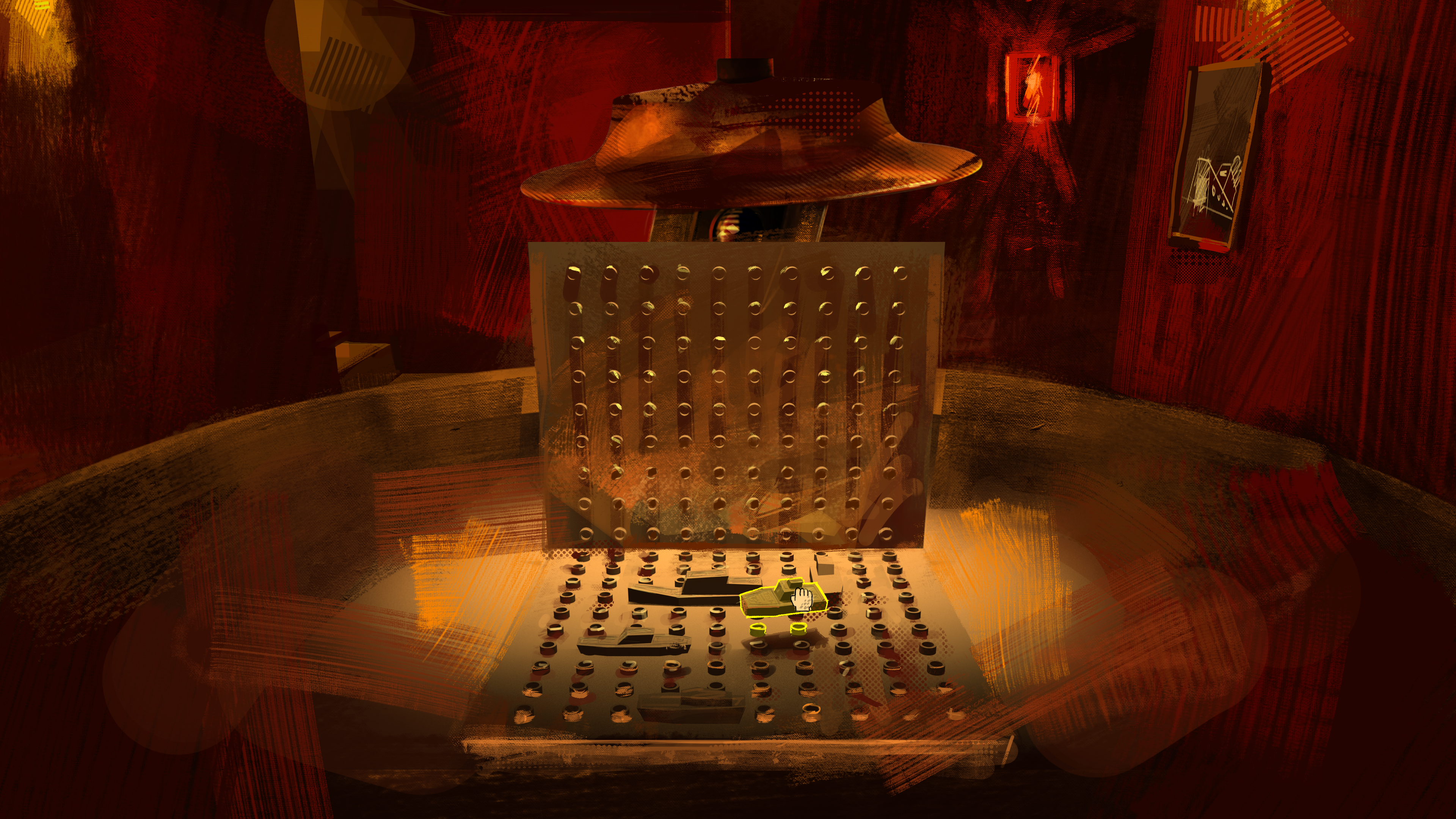
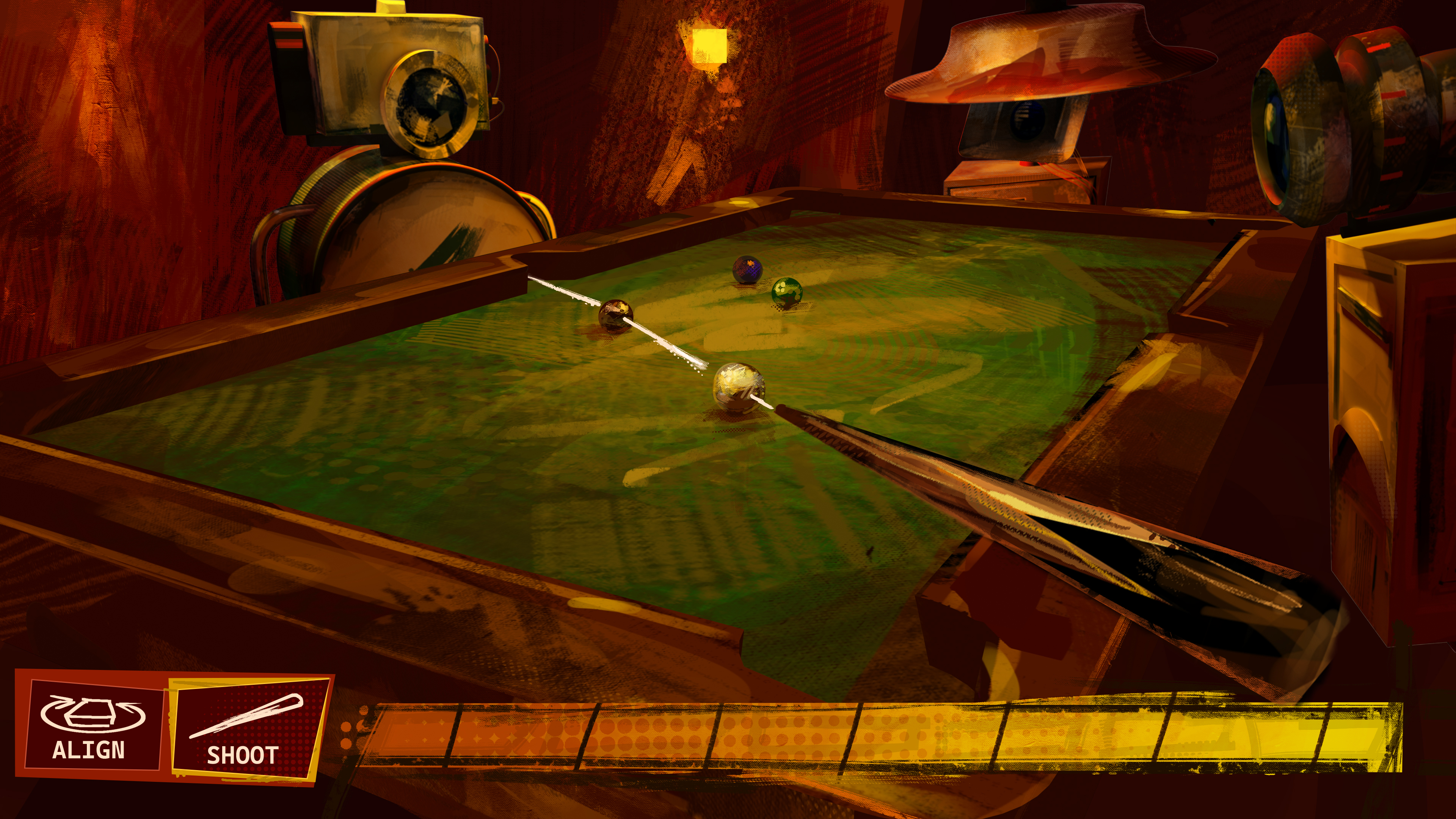
This is definitely the weakest of all the briefs in the project, and you can see the rush for time really coming through — especially in the character lighting that had to be hand painted in photoshop using blend mode layers overtop the 3D character renders. Nevertheless, from afar I think the top two still look cool and portray the look I was going for.
Logo
Chronologicaly, this was the first thing I made for the project. I think the text version turned out quite nice.

When creating the arcade machine icon, I made sure to alter the direction the lines were sloping to give the effect that the lines were leaning on and supporting on eachother and it doesn't feel lopsided. This also made the shapes more dynamic, as they came to a pinch that carries lots of energy instead of just being rotated or on a sheer. I also made sure that the lines near the outside of the icon were straighter, and only let them get more wonky near the center to keep the silhouette readable at a glance.
I also turned the MPG letters into a font at the end of the year.
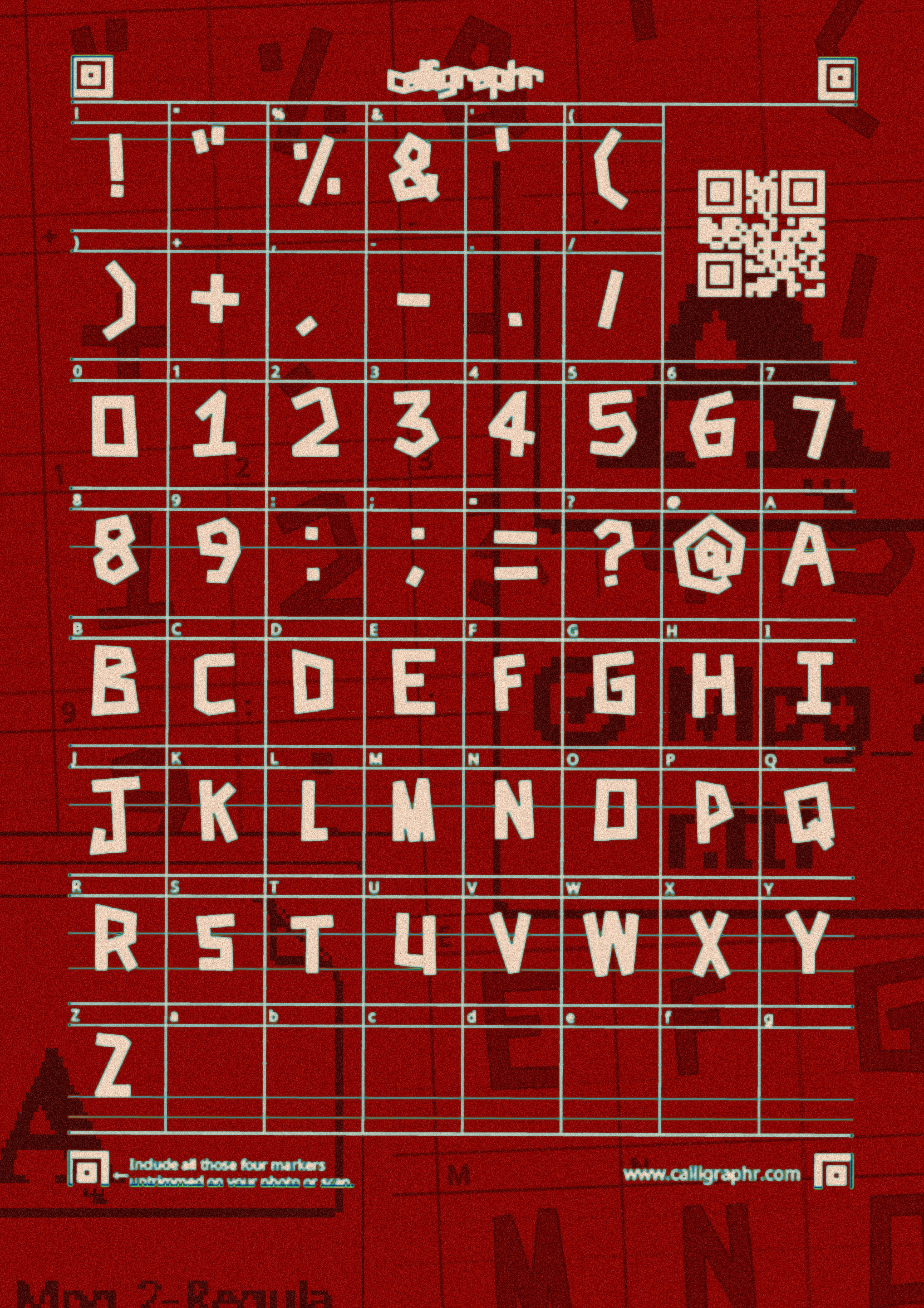
This was made after the assignment had been handed in, so it was just for fun while we waited for the holidays. I made a quick poster thats just a screenshot of the calligraphr template because i thought it looked cool.
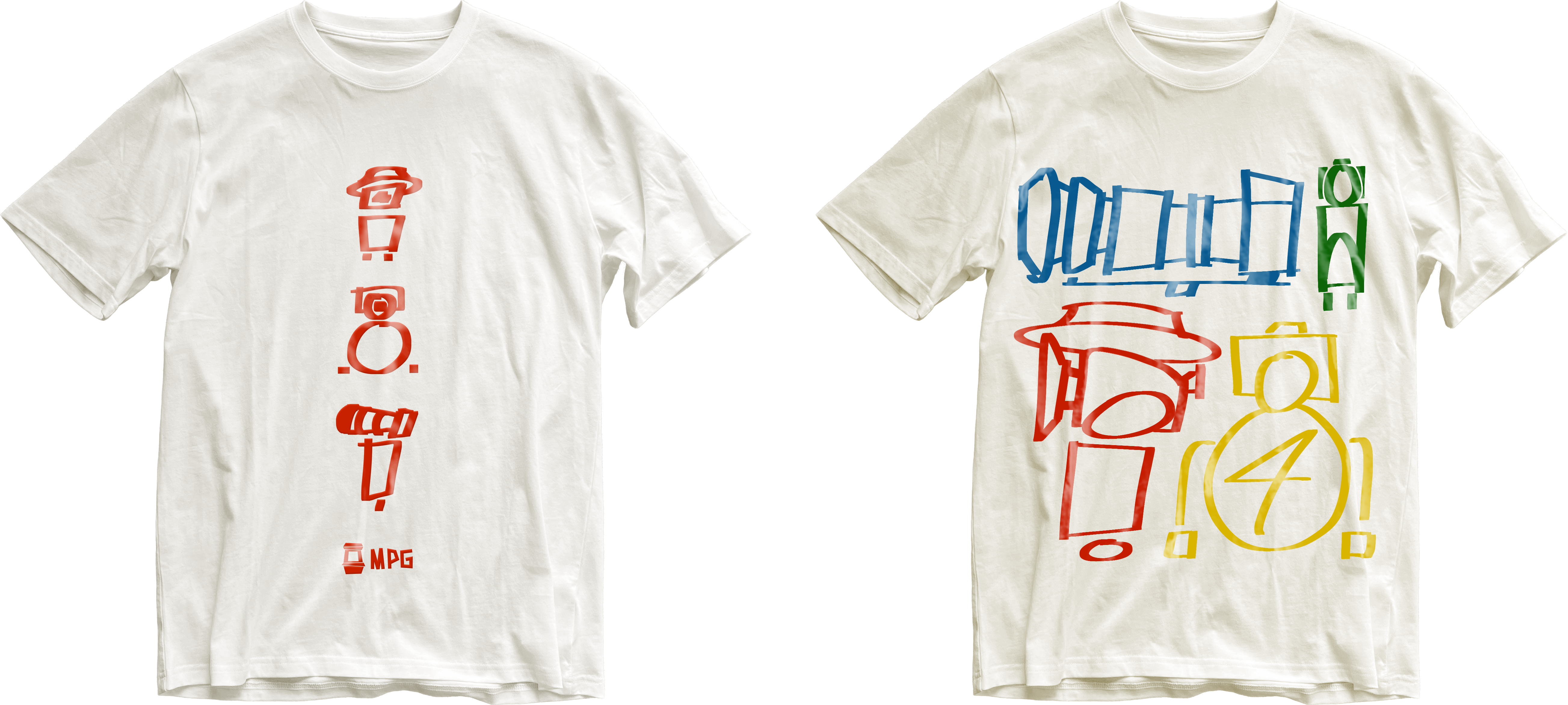
Merchandise
I thought adapting some of my imagery into merch designs would be fun, so I made some T-shirts and keychains.
For the keychains, I wanted to try doing some photorealistic renders that would look like photos of a real product. I chose to have the stickers from the characters be a motif used across the MPG brand such as on merchandise and the games advertising.
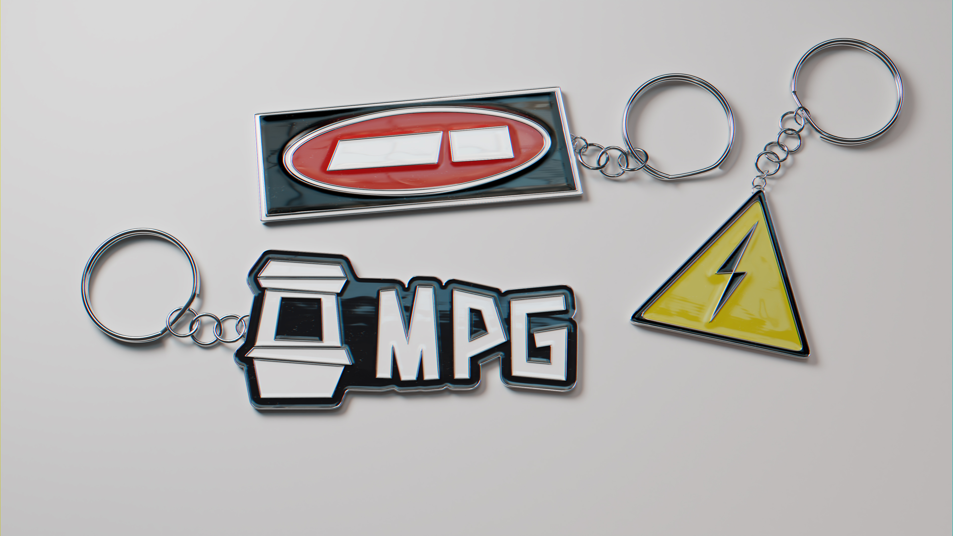
I imported the sticker SVGs to blender as paths to create the metal borders, and made a bump map by adding an inner shadow to each coloured element in photoshop to create the effect of the plastic pushing up at the edges. Finally, I added a larger bump map, this time being a procedural noise texture to act as trapped air bubbles. After some dust, a super simply modeled keychain and an HDRI for the reflections, that's pretty much it.
The process was quite simple, but I think they turned out well.
The T-shirts were simple enough to make, so there's not really anything interesting to say about them. I do think they look cool enough though.
Conclusion
I really enjoyed working on MPG. Although I wish I could have pushed a lot of things further, I'm still pretty happy with a lot of the stuff I made, and am exited to see my next board in L3.
This is the final board that I submitted to NZQA.